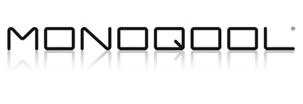
13. Monoqool logo

We open a new document with Inkscape.
With the write text tool
 We write the word "MONOQOOL" with Agency FB font, Condensed typographic style, size 64 points and distance between letters 0.
With the selection tool
 we stretch the text horizontally until the letter O is squarer.
We duplicate the text with the Control+D keys, we reflect it vertically with the menu
Object... Vertical reflectionand we move the inverted text below the first text adjusting its position exactly with the menuObject... Align and Distribute.
To continue we are going to draw a rectangle that occupies approximately the same size as the text below.
The rectangle should have a linear gradient with black below and almost white above, with no transparency.

This rectangle will serve as a mask to degrade the color of the text. The whiter areas will leave the text darker in color and the blacker areas will leave the text lighter, barely visible.
We select the text above and the rectangle and align the two objects.

We adjust the vertical size again so that it resembles the text size as much as possible.

Now we select the rectangle and the text below it and select the menu operation
Object... Mask... Apply.We have already achieved a reflection effect of the text.

To make the reflection more subtle, we are going to select the text below and in the
Object... Fill and Strokes...menu in the Fill options we are going to change the transparency to 50.
And we already have the finished logo.
